As a real estate professional, you know how important marketing is. You are constantly marketing yourself, your business and your listings.
Making your
REALTOR.ca listings shine is easy thanks to all of the
REALTOR.ca Tools available to you as a member of the Canadian Real Estate Association. However, if you're designing your own print materials such as flyers, posters, business cards, letterheads or lawn signs, you may need a little help. The wrong colour or a wonky font could come between you and your next lead.
We’ve turned to CREA’s team of skilled designers to curate a list of design dos and don’ts in case your marketing materials could use a bit of attention.
Dos
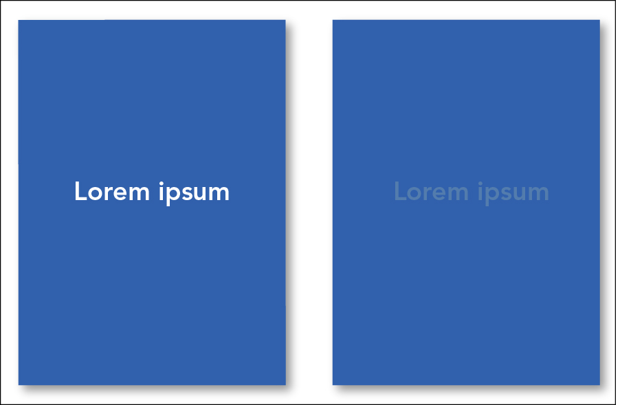
Ensure your text is visible on a coloured background: Not only is it bad design to have unreadable text, your province may have an accessibility law that requires you to make sure the contrast is compliant with Web Content Accessibility Guidelines (WCAG 2.0) or other accessibility guidelines. You can check if the two colours pass using this
handy tool.
 Allow white space:
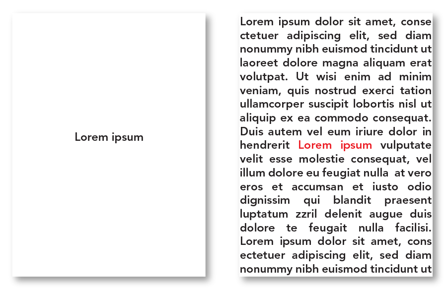
 Remember: less is more. Avoid clutter and allow your design to breathe. Pages that are too heavy in content can be overwhelming to readers and take away from the intent of the piece. Keep things simple, to the point and don’t be afraid of empty space.
 Understand colour theory: Colour is a powerful design tool
. It can help evoke different emotions and reflect different sentiments. For example, red is often associated with love or intensity while purple stands for royalty and luxury.
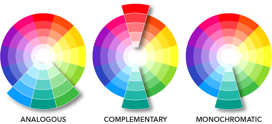
When creating a palette for your design, you could use analogous (colours that are adjacent to one another on the colour wheel), complementary (colours on opposite sides of the colour wheel) or monochromatic (several shades of the same colour).
Whatever colour palette you chose, remember to stay consistent. Using the same colours throughout your marketing material will help make your personal brand recognizable.
Don’ts
Don’t overuse decorative fonts: Decorative fonts can be great for titles or small bits of information but using them for main body text is difficult to read.
You should also limit your design to one or two fonts and font sizes. If you're going to use multiple fonts, use one for a headline and the other for the body text. Too many fonts or font sizes are distracting and take away from your message.
Examples of fonts to avoid include:
 Don’t use vibrating colours:
 Do you ever feel dizzy when looking at a design? Vibrating colours could be to blame. Vibrating colours is an effect that occurs when the edges of two adjacent colours appear to merge, blur and glow, giving the illusion of motion. This can be very hard on the eyes.
 Don’t use clipart or low-quality images:
 Using clipart or low-quality images can make your design look unprofessional and dated. If you don’t have time to take your own photos, you can use a photo service like
Shutterstock,
iStockphoto or
Unsplash.
[caption id="attachment_32979" align="aligncenter" width="896"]

Beautiful two storey residential house with dormers and attached garage[/caption]
Keep these tips in mind to help ensure your marketing materials will promote your business and catch the eyes of prospective clients.
Do you have a favourite design tip? Tell us about it in the Comments section.

 Allow white space: Remember: less is more. Avoid clutter and allow your design to breathe. Pages that are too heavy in content can be overwhelming to readers and take away from the intent of the piece. Keep things simple, to the point and don’t be afraid of empty space.
 Understand colour theory: Colour is a powerful design tool. It can help evoke different emotions and reflect different sentiments. For example, red is often associated with love or intensity while purple stands for royalty and luxury.
When creating a palette for your design, you could use analogous (colours that are adjacent to one another on the colour wheel), complementary (colours on opposite sides of the colour wheel) or monochromatic (several shades of the same colour).
 Whatever colour palette you chose, remember to stay consistent. Using the same colours throughout your marketing material will help make your personal brand recognizable.
 Don’t use vibrating colours: Do you ever feel dizzy when looking at a design? Vibrating colours could be to blame. Vibrating colours is an effect that occurs when the edges of two adjacent colours appear to merge, blur and glow, giving the illusion of motion. This can be very hard on the eyes.
 Don’t use clipart or low-quality images: Using clipart or low-quality images can make your design look unprofessional and dated. If you don’t have time to take your own photos, you can use a photo service like Shutterstock, iStockphoto or Unsplash.
[caption id="attachment_32979" align="aligncenter" width="896"]
 Beautiful two storey residential house with dormers and attached garage[/caption]
Keep these tips in mind to help ensure your marketing materials will promote your business and catch the eyes of prospective clients.
Do you have a favourite design tip? Tell us about it in the Comments section.


